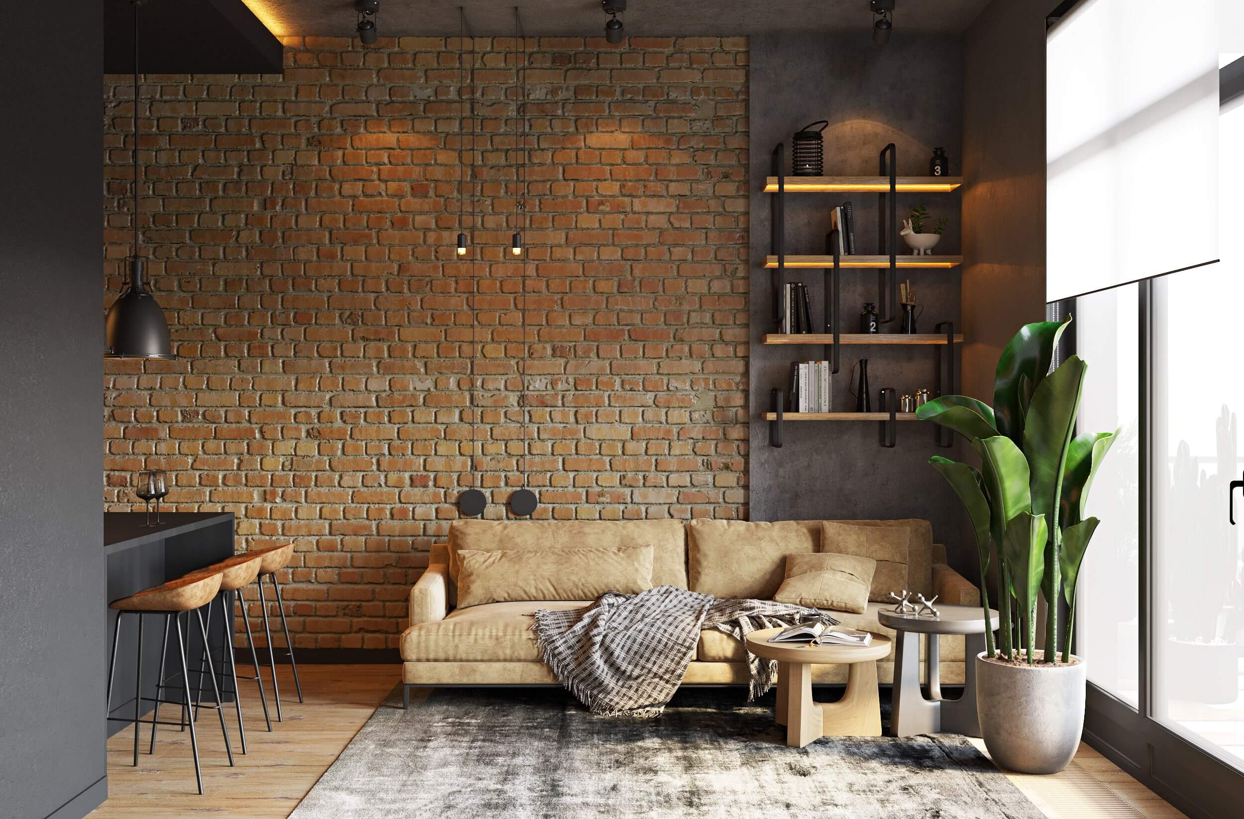
Comfort is expressed in the choice of soft furniture with rounded shapes, smooth lines, and pleasant-to-touch materials. Cotton, linen, and wool textiles add coziness and warmth. Warm and muted colors create an atmosphere of calm and relaxation.
Coziness is emphasized by handmade accessories that add personality and uniqueness to the interior. Indoor plants enliven the space, purify the air, and provide a sense of connection with nature. Soft and subdued lighting creates an atmosphere of intimacy and tranquility.
Connection with nature is becoming increasingly important for modern people. Designers embody this by using natural materials such as wood, stone, and rattan. Natural colors and textures harmoniously blend with the surrounding environment, creating a sense of unity with nature. Large windows allow natural light to penetrate the space, making it feel more spacious and fresh.
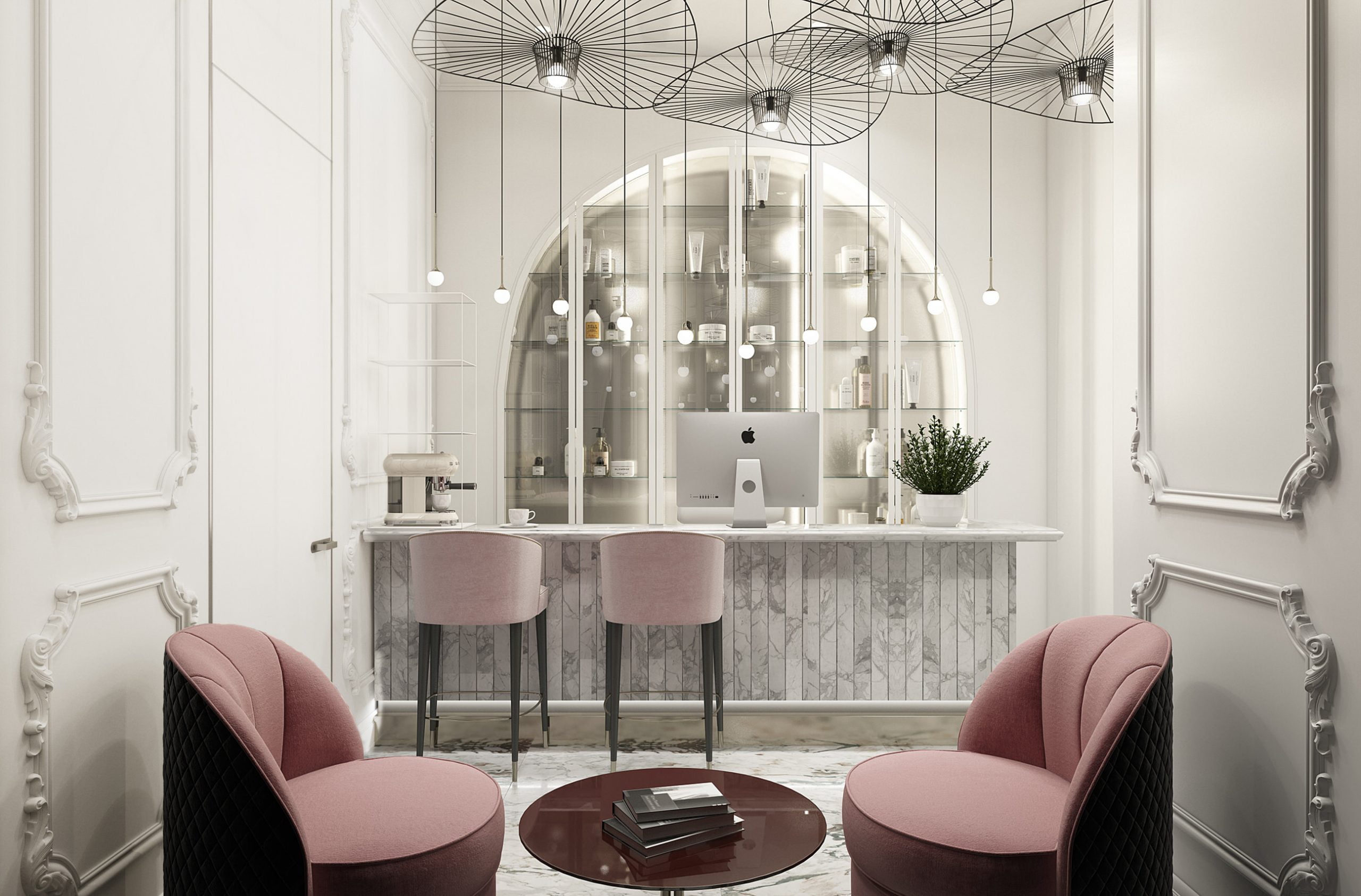
Combination of neutral and rich colors is one of the key characteristics of modern interior design. Neutral colors, such as white, beige, and gray, serve as a base, on which rich accents of green, blue, terracotta, and other colors are highlighted. This contrast creates dynamic and interesting spaces that do not lose their coziness and comfort.
Popular Color Palettes of 2024
The variety of colors makes interior design truly interesting and original. The year 2024 offers a wide range of fashionable palettes to suit any taste.
Neutral Shades
Neutral shades reflect neutrality and naturalness, creating an impression of simplicity and calm. They can include shades of beige, sand, pale pink, peach, light brown, and more.
Neutral shades are excellent for creating a gentle and elegant interior, adding warmth and coziness. They are also versatile as they easily combine with other colors and styles. Neutral shades can be used as primary colors in an interior or as accent elements, complementing them with more vivid or rich colors. Uses:
- Use in modern design: Neutral colors include beige, cream, milk, peach, and other soft and neutral shades. They create an elegant and refined atmosphere, visually expand the space, and make it brighter. Neutral colors are ideal for small spaces as well as for creating a backdrop in large rooms.
- Psychological impact on spatial perception: Neutral shades give a sense of calm, serenity, and coziness. They seem to envelop the room with warmth, creating an atmosphere of safety and comfort.
Pastel Colors
Pastel colors create an atmosphere of tenderness and elegance in a room. They are ideal for creating a cozy and soothing interior, where it is important to foster a sense of calm and harmony. Uses:
- Creating lightness and tenderness: Pastel colors include pale pink, blue, lavender, mint, and other soft shades. They visually make the space lighter, airier, and more spacious. Pastel colors are perfect for bedrooms, children’s rooms, and relaxation areas.
- Advantages in interior design: Pastel colors combine well with other colors, creating interesting and harmonious combinations. They can be used for walls, furniture, textiles, and decor.
Bold Colors
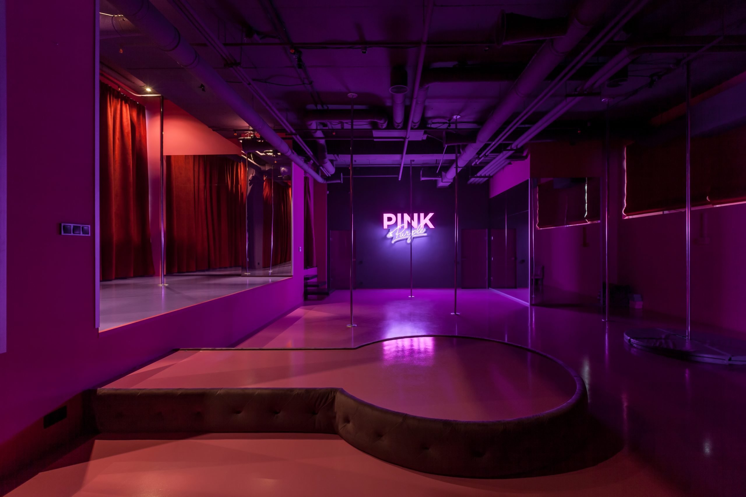
Using bold colors in interior design can add character and style to a space, making it more dynamic and interesting. They are great for creating accents or highlights that catch the eye and can be used as unique elements in the interior.
- Experiments with bright and rich shades: The year 2024 gives a green light for experimenting with bright and intense colors such as blue, green, terracotta, and yellow. These colors can serve as accents in the interior, adding energy, dynamism, and originality.
- Ideas for creating accents: Bright colors can be used for painting one wall, for furniture, textiles, or decor. For example, a bright chair, rug, or painting can become the focal point of the room and set the tone for the entire space.
Interior Design Trends for This Year
Choosing colors for the interior is not just an aesthetic decision. It is influenced by numerous factors, including cultural and social trends.
Influence of Cultural and Social Factors on Color Choices
Cultural and social factors play a significant role in choosing colors for the interior. Here are a few examples:
- Return to nature. The desire for connection with nature makes green, brown, and terracotta shades increasingly popular. These colors create a sense of peace, coziness, and harmony. They can be used both in the main design and as accents.
- Attention to ecology. More and more people are choosing eco-friendly and sustainable materials. This affects the color palette, making natural and muted shades more popular. The use of eco-friendly materials reflects a responsible attitude towards the environment.
- Search for individuality. People seek to create unique and personal spaces. This leads to the popularity of unusual color combinations. Don’t be afraid to experiment with colors to find what you like.
- Impact of social media. Interior design trends are often borrowed from social media, where certain aesthetics and colors become popular. Follow the trends but don’t forget your personal style.
Neutral Colors
Neutral colors are the foundation of any interior. They provide a sense of calm, coziness, and visually expand the space.
Using Beige and Cream:
- Beige and cream are classic neutral colors that never go out of style.
- They pair beautifully with other colors, making them more refined and elegant.
- Beige and cream are ideal for creating backgrounds in interior design.
Advantages of Gray Tones:
- Gray is a versatile neutral color that fits any interior style.
- It can be either warm or cool, offering many design possibilities.
- Gray pairs well with bright accents.
It’s important to remember that neutral colors don’t have to be boring. They can be used to create interesting and stylish interiors by combining different textures, materials, and decor.
Expressive Colors
Expressive colors are a great way to add energy, dynamism, and originality to your interior.
Effect of Red Tones:
- Red is a symbol of passion, energy, and strength.
- It can visually make a space feel smaller but cozier.
- Red is used for accents, such as painting one wall, furniture, or decor.
Depth of Blue and Green:
- Blue and green are two of the most popular colors in interior design.
- They provide a sense of calm, tranquility, and connection with nature.
- Blue and green can be used for walls, furniture, textiles, and decor.
Trendy Color Combinations for 2024
2024 offers numerous trendy color combinations for interior design:
- Neutrals + Expressive: Combining neutral colors (beige, gray, white) with bright accents (red, blue, green).
- Pastel + Nude: Combining soft pastel colors (light blue, pink, mint) with gentle nude shades (beige, cream, peach).
- Black + White: A classic combination that always looks stylish and elegant.
Perfect Combinations for Modern Interiors:
- Gray + Terracotta: An elegant combination that blends modernity with warmth. Gray gives a contemporary look, while terracotta adds depth and coziness.
- Green + Mint: A fresh and light combination that creates a feeling of nature and tranquility. Green adds freshness, while mint provides lightness and sophistication.
- Blue + Beige: A calm and harmonious combination that creates a sense of peace and comfort. Blue adds depth, while beige creates a warm and cozy atmosphere.
Subtleties of Harmonious Color Combinations:
- Color Wheel: Use the color wheel to find colors that are next to or opposite each other. For example, colors next to each other usually harmonize well, while colors opposite each other create contrast.
- 60-30-10 Rule: This rule defines proportions for using colors in a room. 60% dominant color is used for walls and furniture, 30% for secondary color on textiles and other accessories, and only 10% for accent color, which can be used for additional accessories or design details.
- Warmth and Coolness: Combining warm and cool colors can create interesting contrasts in interiors. For example, a combination of warm shades of red and orange with cool shades of blue or purple can create a sense of balance and harmony in a space.
- Lighting: Remember that lighting can affect the perception of colors. Natural light makes colors more vivid, while artificial light can change their shade. When choosing a color palette, consider the type and direction of lighting in your space.
How Trendy Wall Colors Highlight Your Interior
Trendy wall colors are the foundation for a stylish and harmonious space.
Supporting Colors:
- Textiles: Curtains, cushions, and throws in the same color range will highlight the wall colors, making the interior cohesive. Add contrast or, conversely, softness and coziness.
- Decor: Vases, paintings, and figurines in the room’s color scheme will create interesting accents. Whether bright or neutral decor, the key is to ensure it harmonizes with the wall and furniture colors.
- Furniture: Matching the tones of furniture and walls (temperature, lightness) creates a harmonious space. Bright walls – neutral furniture, neutral walls – bright furniture.
Examples:
- Gray Room: Add terracotta, green, or blue cushions, paintings, and vases.
- Green Room: Use textiles and decor in mint, beige, or brown tones.
- Blue Room: Highlight the interior with white furniture and gold or silver decor.
The Psychology of Colors in Interior Design
Colors are not just an aesthetic element of design; they are also a powerful tool affecting our perception, emotional state, and even well-being.
Impact on Mood and Emotions:
- Warm Colors (Red, Orange, Yellow): Stimulate, energize, and warm. Recommended for dining rooms, kitchens, and living rooms.
- Cool Colors (Blue, Green, Purple): Calm, relax, and cool. Ideal for bedrooms, bathrooms, and offices.
- Neutral Colors (White, Gray, Beige): Create a sense of calm, tranquility, and visually expand space. Suitable for any room.
Choosing Colors Based on Room Functionality:
- Bedroom: A place for rest and sleep, so it’s recommended to use calm and relaxing colors: blue, lavender, mint, gray.
- Kitchen: A space where we cook, eat, and gather with family. Warm and invigorating colors are suitable: yellow, orange, green.
- Living Room: A room for socializing and hosting guests. Neutral colors (beige, gray) can be used as a background, with accent colors (red, blue, purple) added through furniture, decor, or textiles.
- Children’s Room: For children, it’s better to use light and cheerful colors: green, yellow, blue, pink.
Trends in Decorative Material Colors
2024 is a time for bold experiments and unconventional combinations! This trend is also evident in the color palette of decorative materials, where a kaleidoscope of shades is available to suit all tastes.
Trendy Paints and Wallpapers:
- Geometric Patterns:
- Abstract Shapes: Wallpapers with abstract patterns or geometric shapes give a modern look. These can include asymmetrical patterns, lines, circles, and other geometric forms that create an interesting visual effect.
- Multilayered Designs: Wallpapers with complex multilayered patterns or textures add depth and luxury to a space. They can include combinations of various colors and textures to create a unique appearance.
- Soft and Natural Shades:
- Pastel Tones: Wallpapers and paints in pastel shades like pale pink, mint, or blue are becoming increasingly popular. These colors create a gentle and serene look, ideal for a calm atmosphere in any room.
- Earthy Tones: Paints and wallpapers in natural shades like sandy, beige, or brown provide warmth and coziness. These colors blend perfectly with natural materials and create an eco-friendly look for the interior.
Latest Shades of Paints and Coatings:
- Ombre Effect: A smooth transition from one color to another, such as from terracotta to brown or from green to beige, creates a dynamic and original background.
- Metallic Shades:
- Gold: Symbolizes luxury and wealth. (Example: Gold picture frames in the living room.)
- Bronze: Adds a touch of vintage.
- Silver: Associated with elegance and lightness.
- Textured Paints:
- Stone Imitation: Visualizes durability and reliability. (Example: A wall in the living room decorated with stone-textured paint.)
- Wood: Provides a sense of warmth and coziness.
- Fabric: Adds elegance.
Recommendations for Choosing Decorative Materials:
- Interior Style:
- Modern Style: Use neutral colors with bright accents to create a modern and energetic interior.
- Classic Style: Opt for warm and natural shades to give the room a traditional and cozy look.
- Loft: Use gray, white, and black to create a modern and industrial look characteristic of the loft style.
- Room Size:
- Small Rooms: Use light colors to visually enlarge the space and make it feel more spacious and bright.
- Spacious Rooms: Feel free to use dark colors to create a cozy and intimate atmosphere.
Color Accents in Interior Design
Color accents are a great way to add dynamism, originality, and make the interior more interesting.
Using Accents to Focus Attention:
- Accent Wall: Paint one wall in a bright color or cover it with wallpaper.
- Furniture: A bright sofa, chair, or table can become the focal point of the room.
- Decor: Paintings, vases, textiles – all can be used to create accents.
Original Ideas for Color Details:
- Bright picture or photo frames.
- Colored moldings on the ceiling or walls.
- Decorative pillows and throws with contrasting patterns.
- Rugs with bright patterns.
- Bedroom with warm lighting and beige walls to create a cozy atmosphere.
- Living room with bright lighting and white walls to visually expand the space.
- Kitchen with green lighting and green accents to create a fresh feeling.
Color Trends for Your Home
Your home is a place where you can relax, recharge, and feel truly at home. With the help of colors, you can create an atmosphere that matches your needs and lifestyle.
Cozy Bedroom
Creating a cozy bedroom is an art where every element contributes to your rest and relaxation. Here are some tips to help you create a space where you will feel comfortable and at ease:
- Soothing Colors:
- Light Blue: Provides a sense of calm and tranquility, like the endless sky enveloping you with its warmth.
- Lavender: Promotes relaxation and better sleep, immersing you in the gentle and fragrant atmosphere of a lavender field.
- Green: Creates an atmosphere of calm and connection with nature, reminding you of the freshness of the forest and the rustle of leaves.
- Beige: A neutral color that provides a feeling of comfort and warmth, wrapping you in a soft, velvety backdrop.
- Creating a Calm and Relaxing Atmosphere:
- Use soft and muted shades: light blue, lavender, mint, gray-green, cream. Avoid sharp transitions and contrasts, as they can visually disrupt the calm.
- Add textiles with pleasant textures: a soft cashmere throw, fluffy velvet pillows, a velvet blanket. These elements will add coziness and comfort to your bedroom.
- Use scented candles with essential oils: lavender, chamomile, sandalwood. These scents promote relaxation and better sleep.
- Ensure soft lighting: use lamps with warm light, sconces, lamps with fabric shades. Avoid bright light that can interfere with sleep.
- Decorate the bedroom with indoor plants: they not only purify the air but also create an atmosphere of connection with nature.
Remember: your bedroom is your personal space for rest and relaxation. Therefore, it is important to create an atmosphere that provides you with a sense of calm, comfort, and serenity.
Living Room Where the Whole Family Gathers
Creating a cozy and functional living room where the whole family gathers is important for building connection and togetherness. Here are some tips for creating such a space:
- Optimal Colors for Coziness.
- Warm and Neutral Colors:
- Beige: Creates a feeling of calm and provides coziness, similar to a soft cashmere throw.
- Cream: Visually expands the space and adds elegance, enveloping the room in a soft glow.
- Brown: Provides a feeling of stability and reliability, serving as a solid foundation for your family nest.
- Pastel Shades:
- Lavender: Adds a touch of romance and sophistication, filling the room with the gentle scent of lavender.
- Mint: Provides a feeling of freshness and lightness, enveloping the space in the coolness of a summer morning.
- Peach: Creates an atmosphere of warmth and joy, filling the room with sunny light.
- Decorating Ideas Using Colors:
- Use an accent wall: paint it in a more intense color to add visual interest and create a focal point in the room.
- Add bright cushions and throws: they will not only add coziness but also help create contrast and highlight the main color scheme.
- Use indoor plants: they not only purify the air but also add freshness and natural accents, making the atmosphere more lively.
- Add pictures, photographs, or other decorative elements: they will help make the interior more personal and reflect your family values.
Remember: the living room is a place where the whole family gathers, so it is important to create an atmosphere that is cozy and pleasant for everyone. Choose colors and decor that all family members like to make your living room a true center of warmth and togetherness.
Kitchen: The Heart of Activity
In the kitchen, a place of activity, it is important to create not only a functional but also a cozy and welcoming environment. Here are some tips on how to do this:
- Practical Aspects of Color Choice:
- Light Colors: Visually expand the space, making the kitchen appear larger and brighter. This is an ideal choice for small spaces.
- Dark Colors: Can make the kitchen feel smaller but more cozy and elegant. They are best used in spacious areas with good lighting.
- Easy-to-Clean Surfaces: Choose colors and materials that are easy to clean and wash, as the kitchen is a place where food is often prepared.
- Color Solutions for Energy and Vigor:
- Yellow: Provides a feeling of joy and optimism, energizes and improves mood.
- Orange: Stimulates appetite, provides a feeling of warmth, and energizes.
- Green: Creates an atmosphere of freshness and calm, providing a feeling of connection with nature.
- Other Color Solutions:
- White: A classic color that visually expands the space and makes the kitchen brighter.
- Gray: A neutral color that easily pairs with other colors.
- Blue: Provides a feeling of calm and tranquility, making the kitchen more elegant.
- Purple: Symbolizes luxury and sophistication, which can make the kitchen more extravagant.
Remember: choosing a color for the kitchen depends on your personal preferences, the size of the space, lighting, and interior style. Don’t be afraid to experiment and combine different colors to create your dream kitchen.
Here are a few additional tips:
- Use the 60-30-10 rule: 60% – main color, 30% – secondary color, 10% – accent color.
- Use color to zone the space: for example, paint the walls one color and the kitchen furniture another.
- Add accents: textiles, tableware, vases with fruits and flowers will help make the kitchen more cozy and interesting.
It is important that the kitchen is a place where you enjoy being, cooking, and gathering with family and friends.
Bathroom: Your Oasis of Freshness
The bathroom is your personal oasis of freshness and relaxation, so it is important to choose colors that will promote relaxation and provide a comfortable environment. Here are some ideas for coloring your bathroom:
- Light and Neutral Colors:
- White: Visually expands the space, provides a feeling of cleanliness and freshness, making your bathroom resemble a flawless white cloud.
- Gray: An elegant and stylish color that easily pairs with other colors, creating an atmosphere of calm and sophistication.
- Beige: Creates an atmosphere of comfort and warmth, wrapping your bathroom in a soft, velvety backdrop.
- Blue, Green, and Turquoise Shades:
- Create a feeling of freshness and cleanliness: imagine endless ocean spaces, gentle waves, and the coolness of a summer morning.
- Visually expand the space: your bathroom will seem larger and more spacious, as if dissolving in the endless blue of the sky.
- Provide a sense of calm and tranquility: immerse yourself in an atmosphere of harmony and connection with nature, experiencing the healing power of water.
- Other Color Solutions:
- Black: A stylish and extravagant color, but it is better used in combination with other colors to avoid making the bathroom too dark.
- Purple: Symbolizes luxury and sophistication, which can make your bathroom more extravagant.
- Wood: Provides a feeling of warmth and coziness, making your bathroom feel more natural.
Remember: choosing a color for the bathroom depends on your personal preferences, the size of the space, lighting, and interior style. Don’t be afraid to experiment and combine different colors to create the bathroom of your dreams.
Here are a few additional tips:
- Use tiles with different textures: this will help make your bathroom more interesting and dynamic.
- Add accents: textiles, candles, and flower vases will make your bathroom cozier and more personal.
- Use mirrors: they will visually expand the space and make your bathroom brighter.
It’s important that the bathroom is a place where you enjoy being, relaxing, and relieving stress.
Children’s Room: A Space for Creativity
Creating a children’s room is an opportunity to implement creative ideas and create a space where your children can feel their own uniqueness and develop. Here are a few ideas for colorful design of a children’s room:
- Bright and fun colors:
- Stimulate imagination and creativity: let your child’s imagination run wild by surrounding them with a colorful kaleidoscope that inspires new ideas and creative projects.
- Create an atmosphere of joy and carefree: let the children’s room be filled with cheerful and lively colors that provide a sense of happiness and boundless optimism.
- Some popular colors for a children’s room:
- Yellow: provides a sense of joy and optimism.
- Orange: stimulates appetite and energizes.
- Green: creates an atmosphere of freshness and calm.
- Blue: gives a feeling of calm and tranquility.
- Purple: symbolizes luxury and sophistication.
- Thematic wallpapers and decor:
- Help create an interesting and unique design: imagine your child’s favorite fairy tale, exciting journey, or magical world coming to life on the walls of the room.
- Consider the child’s interests: hobbies such as sports, music, animals, or space can become the basis for thematic decoration.
Here are a few additional tips:
- Ensure plenty of natural light: this is important for your child’s health and development.
- Use safe and eco-friendly materials: after all, the children’s room is a space where your child will spend a lot of time.
- Zone the space: allocate areas for sleeping, studying, playing, and storing things.
- Encourage self-expression: give your child the opportunity to participate in decorating the room and choosing the decor.
Remember: the children’s room is your child’s personal space where they should feel safe, comfortable, and cozy. Create an atmosphere that will be conducive to their development, creativity, and self-expression.
Office: A Place for Focus
Creating an office is an opportunity to create a space where you can concentrate fully on work, study, or creativity. Here are a few color schemes you can use to create such a space:
- Calm and neutral colors:
- Help focus on work: neutral colors do not distract attention and create an atmosphere of business activity, setting the stage for productive work.
- Create an atmosphere of calm and business activity: gray, beige, cream, and other neutral colors visually expand the space, making the office brighter and more spacious.
- Some popular colors for an office:
- Gray: an elegant and stylish color that easily complements other colors.
- Beige: creates an atmosphere of coziness and warmth.
- White: visually expands the space and provides a sense of cleanliness.
- Brown: gives a sense of stability and reliability.
- Green and brown shades:
- Relieve eye strain and tension: green, the color of nature, provides a sense of calm and harmony, while brown conveys stability and reliability.
- Create a sense of calm and connection with nature: green and brown shades help you relax and relieve stress, which is important for productive work.
- Here are a few additional tips:
- Ensure good lighting: this is important for vision and overall well-being.
- Use comfortable furniture: chairs, desks, and other furniture should be comfortable so you can work for long periods without feeling fatigued.
- Zone the space: allocate areas for work, document storage, and relaxation.
- Decorate the office with paintings, photos, or other decorative elements: this will help make it cozier and more personal.
Remember: the office is your workspace where you should feel comfortable and productive. Create an atmosphere that will be conducive to concentration, creativity, and making the right decisions.
Color Solutions for Small Spaces
Visual Expansion of Space
For small spaces, it is important to use color solutions that create a visual sense of space and lightness. Here are a few tips:
- Light and neutral colors:
- White: visually expands the space, provides a sense of cleanliness and freshness.
- Gray: an elegant and stylish color that easily complements other colors.
- Beige: creates an atmosphere of coziness and warmth.
- Pastels: light blue, lavender, mint – provide a sense of lightness and space.
- Glossy surfaces: visually expand the space by reflecting light.
- Vertical stripes: visually raise the ceiling, making the room appear taller.
Color Schemes for Small Rooms
For small rooms, it is recommended to use color schemes that create a sense of space and coziness. Here are a few color schemes to consider:
- Monochromatic: an elegant and stylish interior based on one color with different shades (beige, gray, green).
- Analogous: a harmonious and cozy atmosphere using colors next to each other on the color wheel (blue, green, turquoise).
- Complementary: a contrasting and dynamic interior using colors opposite each other on the color wheel (yellow, purple; orange, blue).
Additional tips:
- Mirrors: visually expand the space by reflecting light and creating the illusion of a larger space.
- Avoid large patterns: visually reduce the space, making it feel more confined.
- Multi-functional furniture: saves space and makes the interior more practical.
- Minimalism: avoid overloading the interior with excess details to prevent visually reducing the space.
When choosing colors, it is important to consider the following:
- Size and shape of the room: Small rooms benefit from light and neutral colors for visual expansion, while large rooms can accommodate darker and richer shades.
- Lighting: Consider both natural and artificial lighting. In dim lighting, choose light and warm colors, while in bright lighting, opt for dark and cool shades.
- Interior style: The choice of color palette depends on the interior style. For a modern style, neutral colors with bright accents are suitable, while for a classic style, warm and natural shades are preferred.
- Personal preferences: Consider your own preferences and the emotions you want to evoke in the room. Choose colors you like and that help create the desired mood in the space.
Remember:
- Color can visually expand the space, making a room appear brighter, more spacious, and cozier.
- Don’t be afraid to experiment with different colors and schemes to find what you like.
- If you are unsure of your choices, seek help from a professional interior designer.
Expert Tips on Choosing the Right Color
Choosing Colors That Suit Your Space
Choosing the right colors can greatly enhance the atmosphere of your space and highlight its style. However, before making a choice, it is important to consider a few key aspects.
Consider the Characteristics of the Room:
- Size and Shape of the Room: Large or small, rectangular or square, each room has unique features that should be considered when choosing colors.
- For small rooms: Choose light and neutral colors that visually expand the space, and use vertical stripes to create the illusion of higher ceilings.
- For large rooms: Experiment with dark and rich colors to make the space feel cozier and more comfortable.
- Lighting: Light affects color perception. It is important to choose shades based on the lighting.
- With dim lighting: Choose light and warm colors that make the room feel cozier and warmer.
- With bright lighting: Use dark and cool colors to balance the bright light and make the space more comfortable.
- Interior Style: It is important to choose colors that harmonize with the style of your room.
- Modern style: Neutral colors with bright accents are best suited for modern interiors.
- Classic style: Use warm and natural shades to create a cozy and comfortable atmosphere.
- Loft: Characteristic colors include gray, white, and black, which complement the modern loft style.
- Your Personal Preferences: Don’t forget your own taste and preferences, as your home is your personal space.
Seek Professional Help:
If you are unsure about your choices, consult a professional designer who can help you select the perfect colors for your space.
Recommendations from Professional Designers
- Don’t Be Afraid to Experiment:
- Play with different colors and their combinations to find what you like most and what suits your style.
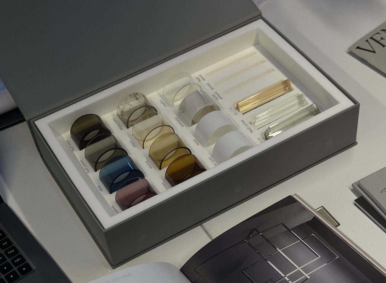
- Use color swatches or paint samples for visualization to anticipate how colors will look in the actual space.
- Maintain Balance:
- Avoid overwhelming a room with one color. Instead, use various colors to create balance and interest.
- Use contrasts between colors to give the room dynamics and depth.
- Consider Color Psychology:
- Each color has its own characteristics that affect our mood and emotions. For example, red can be stimulating, while blue can be calming. Carefully choose colors that fit your lifestyle and needs.
- Use Colors to Zone the Space:
- Define different zones within a room using different colors. For example, use warm and cozy colors for a relaxation area and bright and energetic colors for a workspace.
- Don’t Forget About Decor:
- Add decorative elements such as cushions, rugs, paintings, or vases to complement the chosen colors and give the room a special charm and individuality.
Practical Tips for Painting and Decorating
Step-by-Step Painting Instructions
- Preparation: Clean the walls of dirt, dust, grease, and stains. Remove any nails, screws, staples, and other fixtures. Patch any uneven areas, cracks, and holes. Sand the walls to a smooth surface. Apply painter’s tape to baseboards, doors, windows, and other elements that should not be painted.
- Priming: Apply primer to the walls using a roller or brush. Primer helps paint adhere better and last longer. Wait until the primer is completely dry before moving on to painting.
- Painting: Apply two coats of paint, allowing each coat to dry completely before applying the next. Use a roller for large surfaces and a brush for corners, hard-to-reach places, and details.
- Removing Painter’s Tape: Remove the painter’s tape after the paint has completely dried.
Tip:
- For the best results, use high-quality paint and tools.
- Before painting, test the paint on a small area of the wall to ensure you like the color.
- Follow the paint manufacturer’s instructions regarding drying times and layer applications.
Decorating Techniques Using Colors
- Stripes:
- Vertical stripes will visually lift the ceiling, making the room appear taller.
- Horizontal stripes will visually expand the space, making the room appear wider.
- You can use different colors for stripes to create an interesting and dynamic design.
- Ombre:
- A smooth transition from one color to another can create an elegant and stylish interior.
- You can use ombre on walls, ceilings, or even on furniture.
- Geometric Patterns:
- Geometric patterns can make the interior more dynamic and interesting.
- You can use stencils, painter’s tape, or other tools to create geometric patterns on walls.
- Accent Wall:
- Select one wall in the room and paint it a bright or contrasting color.
- This will help create a focal point in the room.
- Decorative Elements:
- Use paintings, photographs, mirrors, and other decorative elements to add color and individuality to your interior.
Examples of Decorating with Colors Living Room:
- Create an elegant and stylish interior by using ombre on the walls. A transition from white to gray will visually expand the space and add sophistication.
- Use an accent wall to add color and individuality to the room. Paint one wall a bright color you like, such as blue or green.
- Add decorative elements like paintings, photographs, and mirrors. Abstract-patterned paintings and black-and-white photographs will add style to the room, while mirrors will visually expand the space.
Bedroom:
- Use vertical stripes on the walls to visually lift the ceiling. This will make the room appear more spacious and bright.
- Choose calming and relaxing colors like blue, green, or lavender. These colors will help create a cozy and peaceful atmosphere.
- Add cozy textiles like blankets and pillows. Soft blankets and fluffy pillows will make your bedroom even cozier.
Kitchen:
- Use geometric patterns on the walls to add dynamism to the room. You can use stencils or painter’s tape to create interesting patterns.
- Choose bright and cheerful colors like yellow, orange, or red. These colors will boost your mood while cooking.
- Add decorative elements like dishes, vases, and textiles. Bright dishes, beautiful vases with flowers, and textiles with interesting patterns will help create a unique interior.
Impact of Color on Real Estate Sales
Increasing Value
- Light and Neutral Colors: These colors visually enlarge the space, creating a sense of openness and appealing brightness. They give the room a feeling of cleanliness and freshness, which can attract potential buyers looking for spacious and bright interiors.
- Warm Colors: These colors create a cozy and pleasant atmosphere, making the space more welcoming and comfortable for potential buyers. They can encourage a relaxed viewing experience and help buyers imagine themselves in the space, increasing the likelihood of their interest.
- Cool Colors: These colors visually expand the space and give it a feeling of freshness and lightness. They may attract buyers who value a sense of space and openness, as well as those looking for bright and modern interiors.
Popular Colors for Staging
- White: Neutral and versatile, white helps create a sense of space and lightness in any room. It also adds a feeling of cleanliness and freshness, making it ideal for staging.
- Gray: Elegant and modern, gray adds a sense of class and style to the interior. It can be used as a main color or as an accent to create balance and depth in the space.
- Beige: Warm and inviting, beige creates a cozy and comfortable atmosphere. It pairs well with other colors and materials, making it a key element for staging.
- Mint: Fresh and light, mint adds a sense of freshness and liveliness to the interior. It can be used as an accent color or as a main color to create a sense of calm and harmony.
Recommendations
- Consult an interior designer: They can help you choose the best colors and combinations to make your property more appealing to potential buyers.
- Use color samples: Before making a final decision, test colors on small sections of the walls to see how they look in different lighting conditions.
- Keep color trends in mind: Research current color trends and use them to your advantage to create an attractive and modern interior.